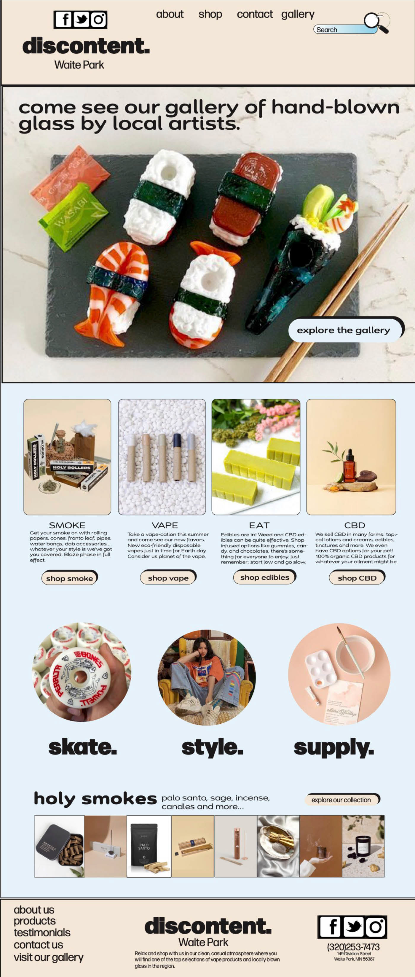
For this assignment, we were asked to design a landing page for a local business whose website could benefit from a refresh. I chose a headshop I visit regularly because I felt confident I could capture its aesthetic and give it a stronger, more contemporary visual identity. The goal of the project was to help the store establish a more compelling online presence and reach new audiences and customers.
Typical landing‑page dimensions range from 1200px to 1440px in height and 320px to 375px in width. Using these measurements, I created a new document in InDesign and set up a series of guides to ensure the layout remained clean, structured, and easy to navigate. Establishing these guides early on helped me organize major content areas—such as the header, footer, and navigation—and provided a clear framework for wireframing the overall design.
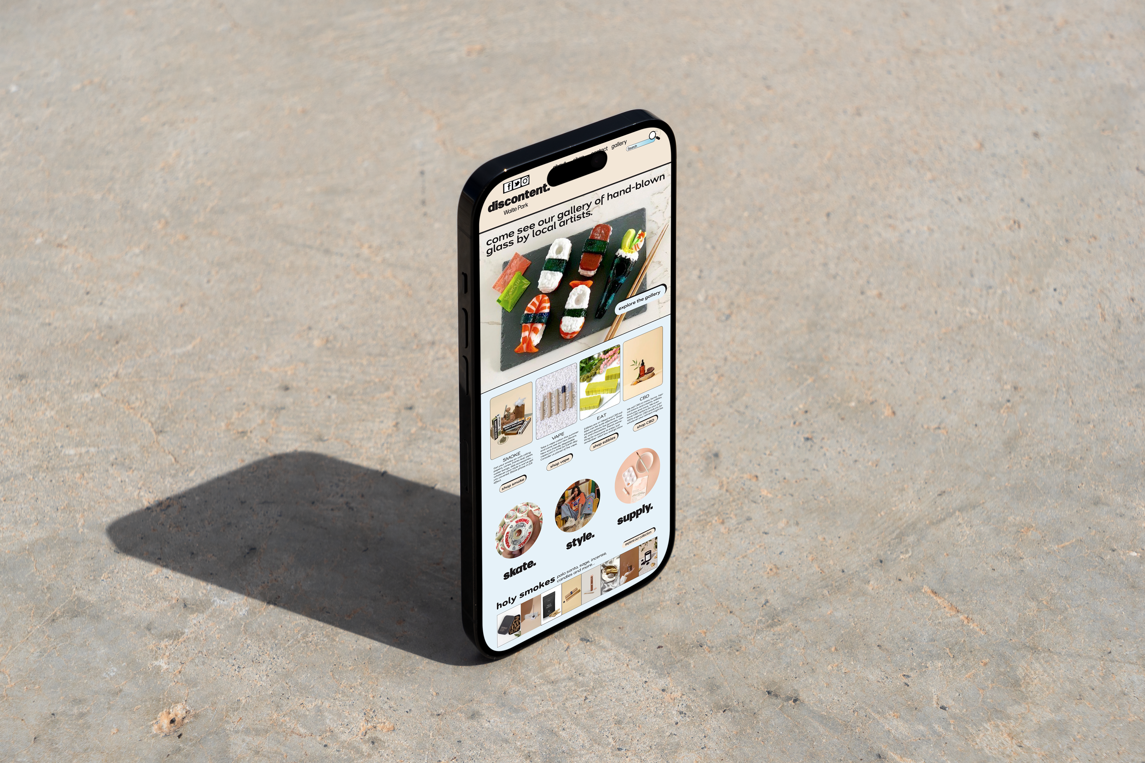
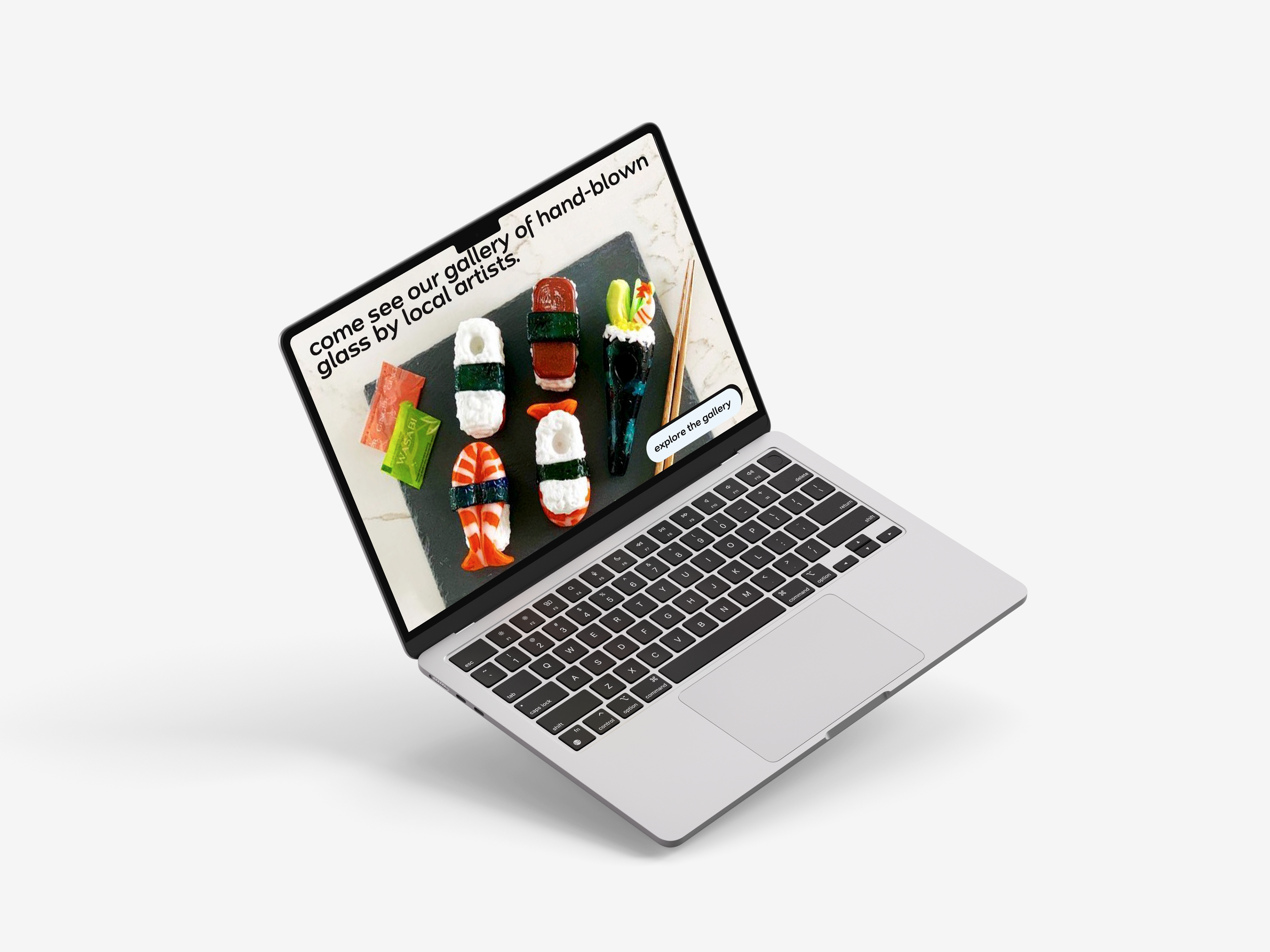
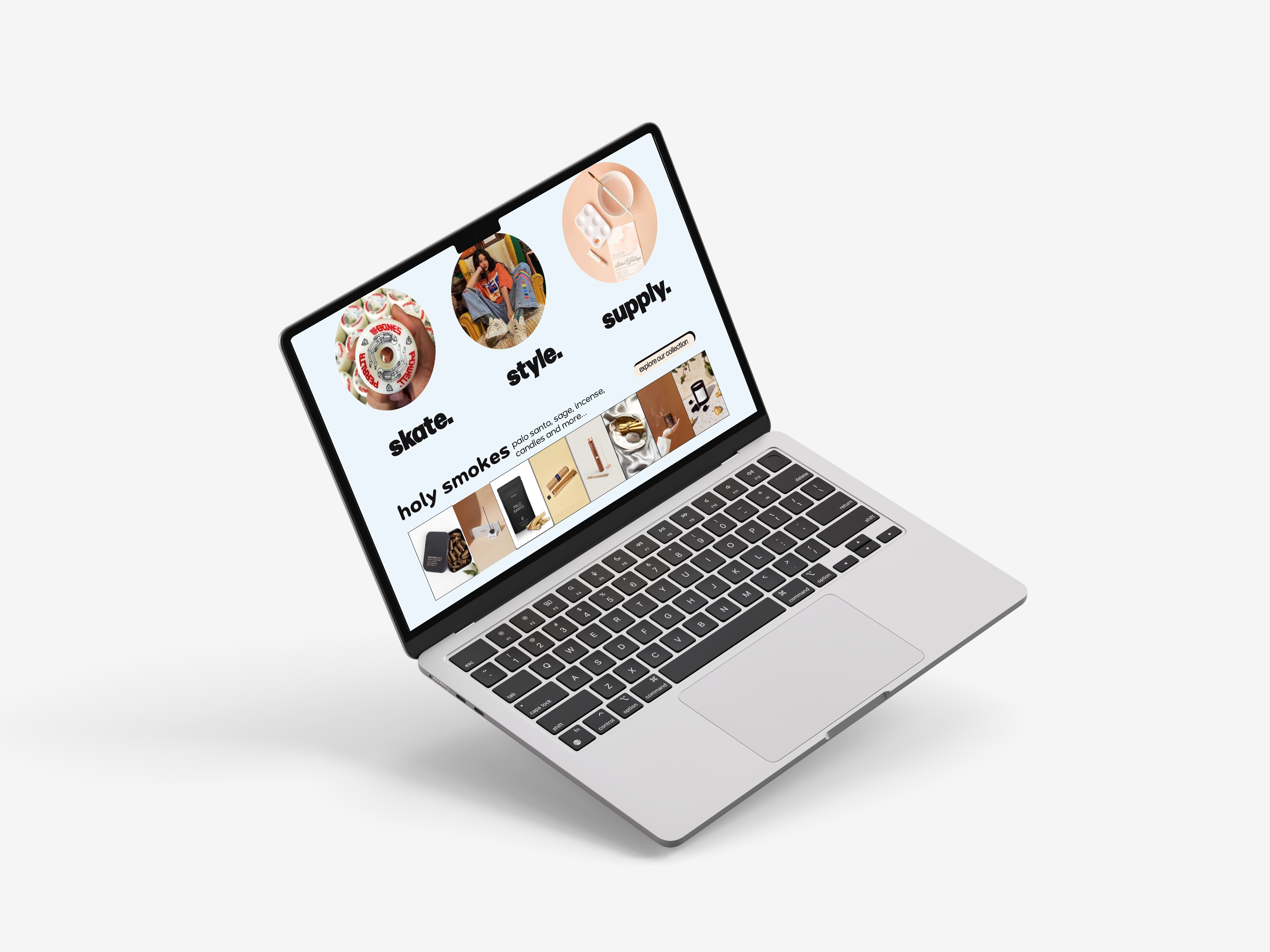
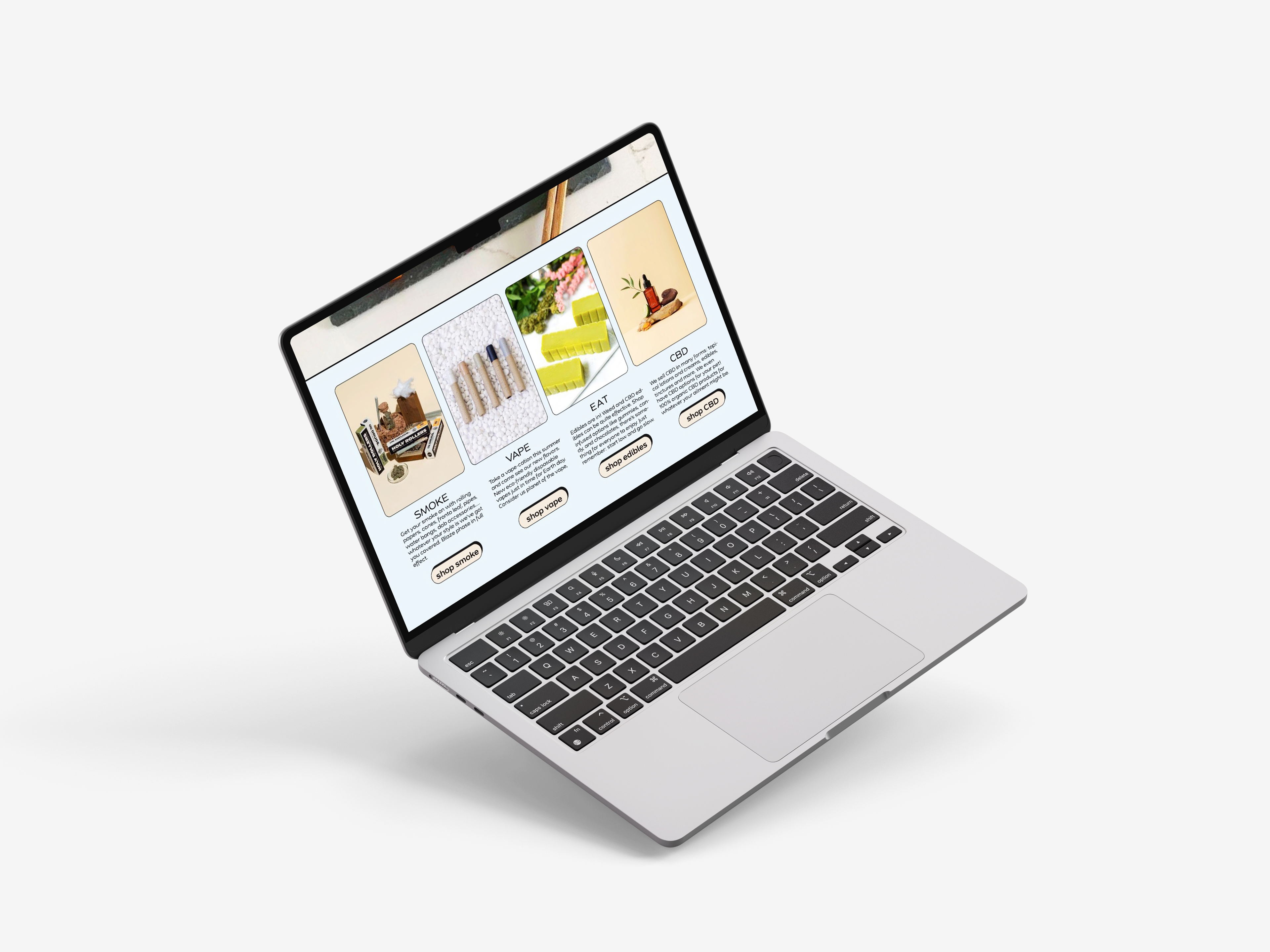
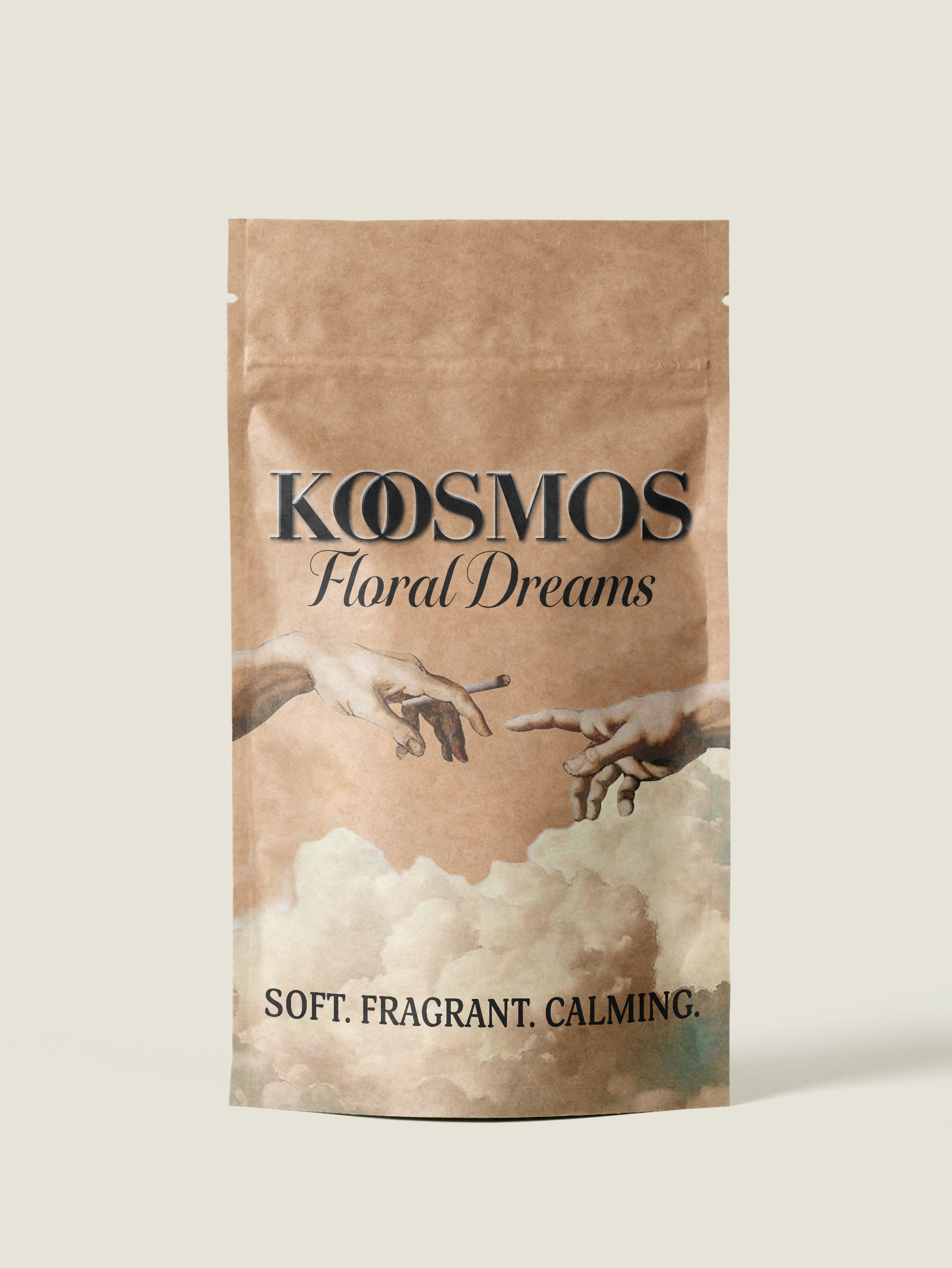
I wanted the landing page to highlight the shop’s impressive gallery of hand‑blown glass pieces, which are a defining feature of the store. However, Discontent offers far more than glassware; they also carry apparel, skate supplies, décor, and other unique items. These aspects of the shop are often overlooked, so it was important to me to feature them prominently in the design. Incorporating strong imagery allowed me to showcase the full range of what the store offers and communicate its personality more effectively.
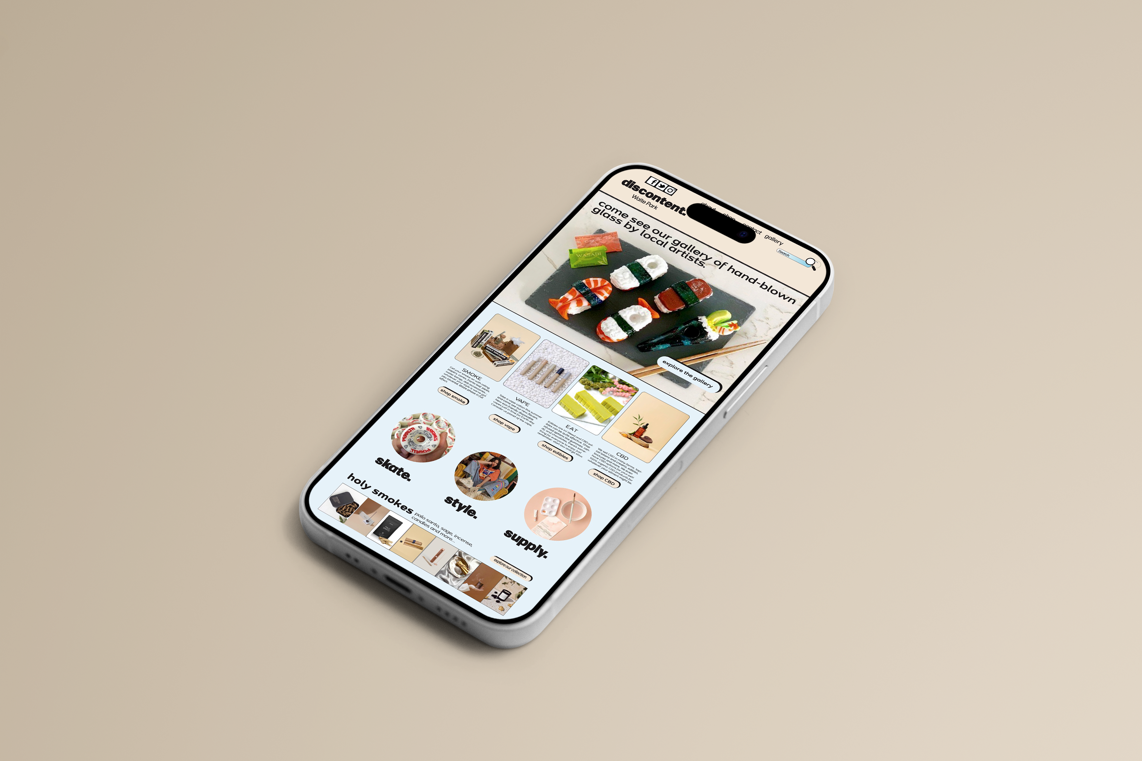
The following mock-ups for both mobile and desktop screens were created using Adobe Photoshop. These mock-ups offer a chance to see my design in context. This helps clients visualize the end product instead of trying to imagine it from a flat layout.
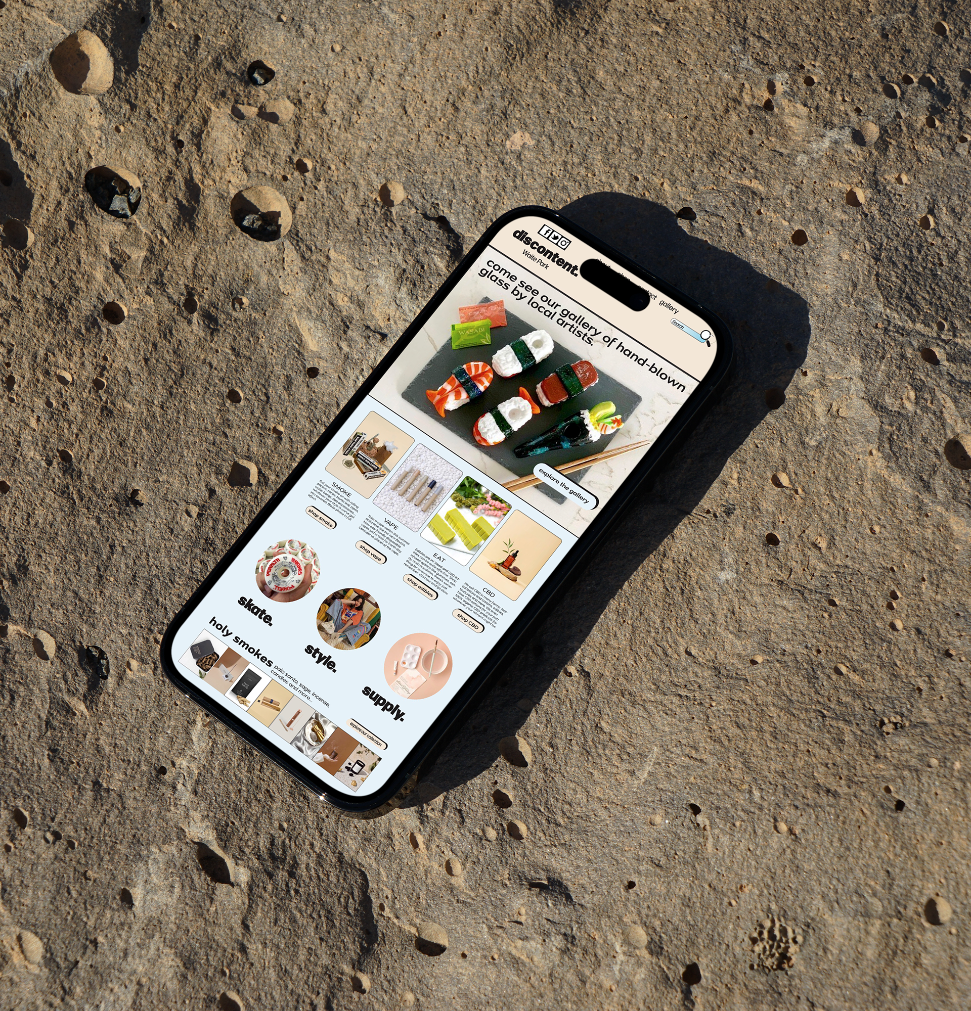
A polished mock‑up makes your work look more refined and intentional. It signals that you understand not just design, but presentation and user experience. Mock‑ups make your work look finished, contextualized, and polished. They show that you understand how design lives in the real world—not just on a canvas.