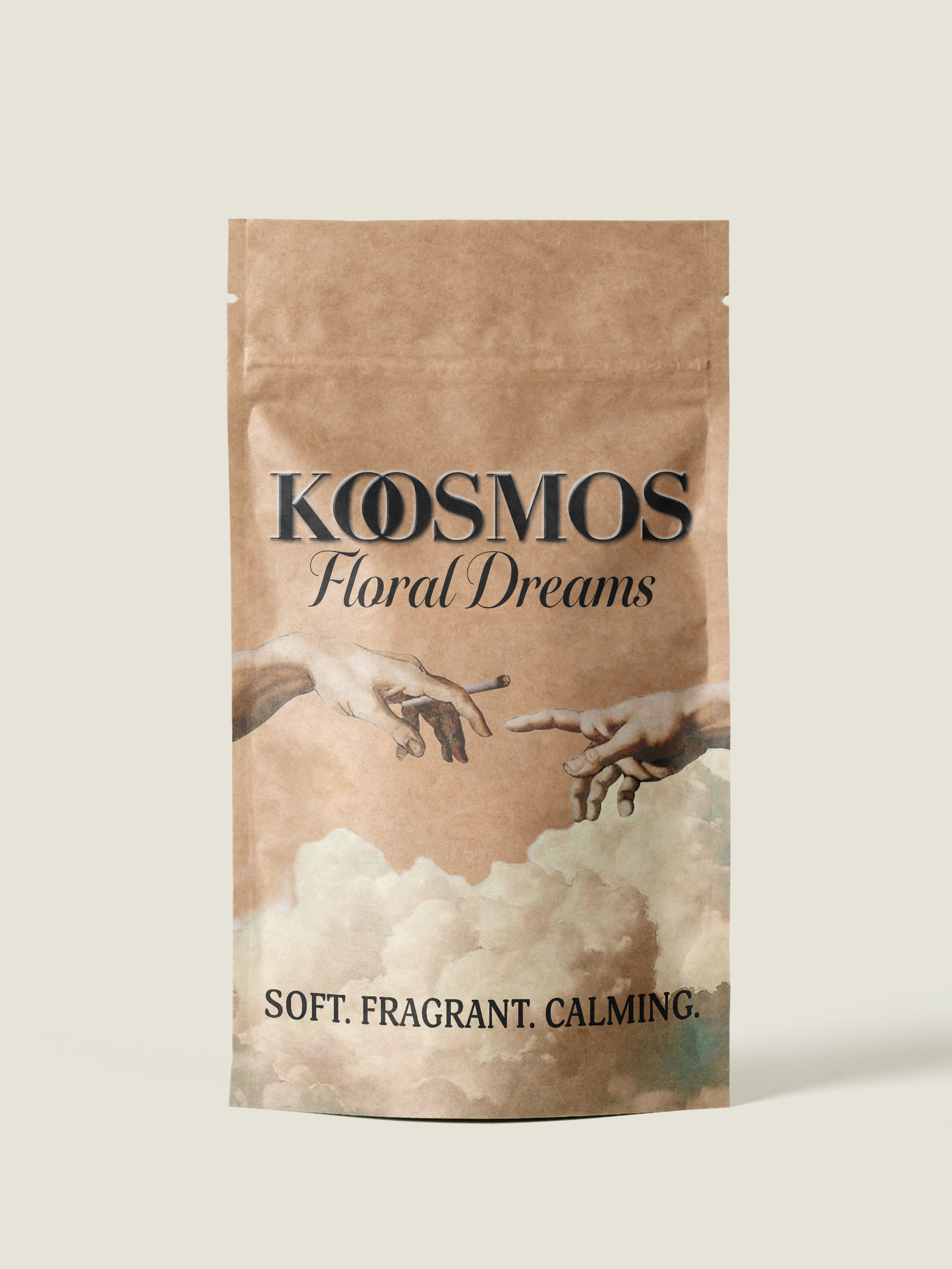
'Kosmos' was a design created for a Print Production course I took while studying at Minneapolis college.The objective was to use dielines for packaging on a flat design. We were given creative freedom for what sort of product and design elements we wanted to use.
I created a product for herbal cigarettes which I named 'Kosmos' using "holy smoke" and "botanicals blended for mindfulness" as taglines.
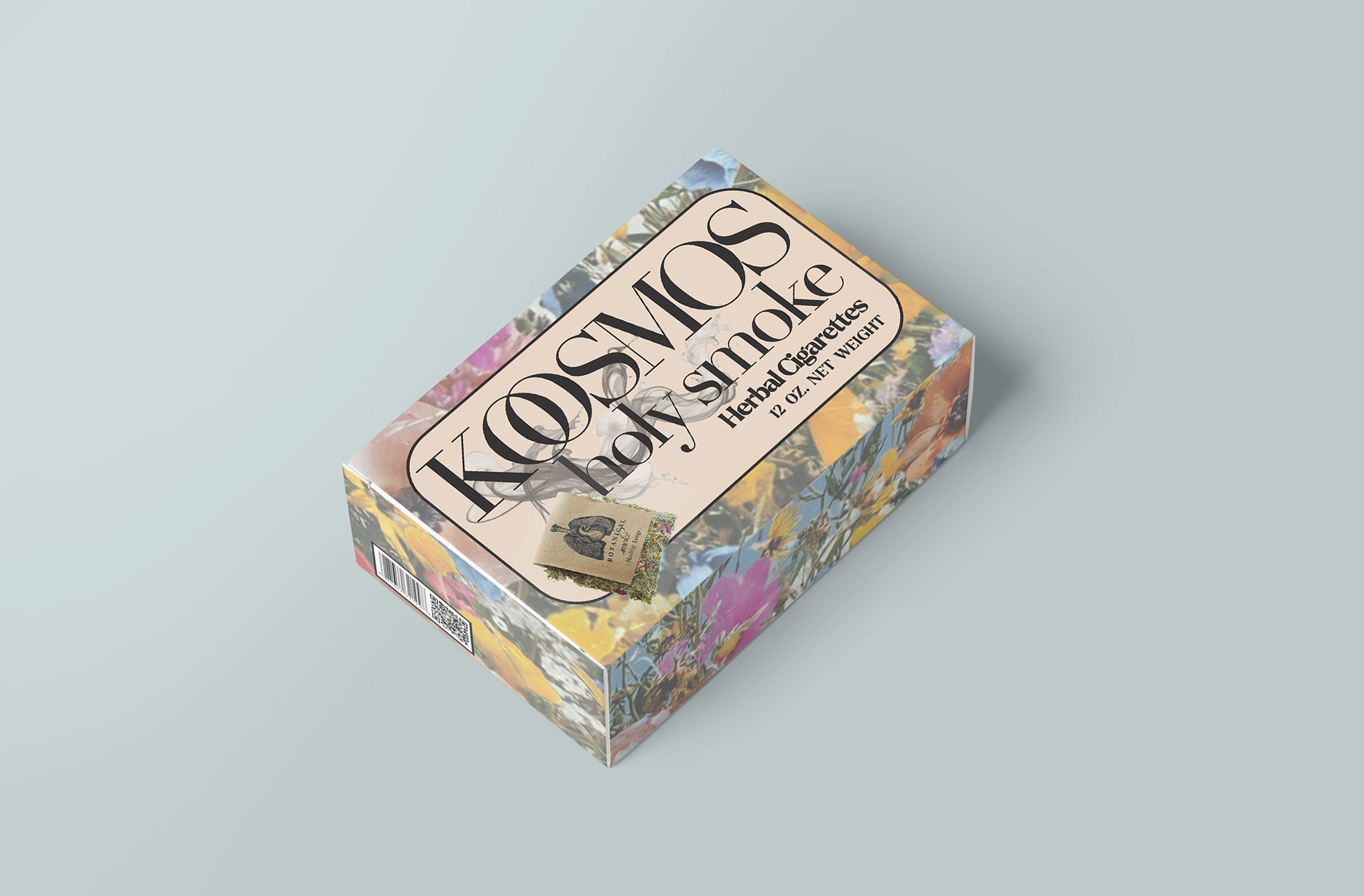
The name Kosmos originates from early Greek and carries several layered meanings. At its core, it refers to a harmonious, ordered system—often used to describe the world and its inhabitants. In philosophical and biblical contexts, it conveys the idea of an orderly universe. Another interpretation of the word relates to adornment, ornamentation, and beauty.
I felt the name was a perfect fit for the product. The concept of smokeable herbs with “magical” properties emerging from a balanced, harmonious world aligned beautifully with the idea of enhancing the packaging through delicate visual adornment. Soft florals, ethereal smoke, and precise anatomical illustrations of the lungs and heart work together to elevate the design. The detailed morphology of the anatomical images reveal structure and formation, and reinforce the theme of an ordered, interconnected system.
For the logo, I intertwined the two “O”s in the name. Beyond serving as a visual enhancement, this union symbolizes harmony, infinity, deep connection, and the convergence of the human and the divine.
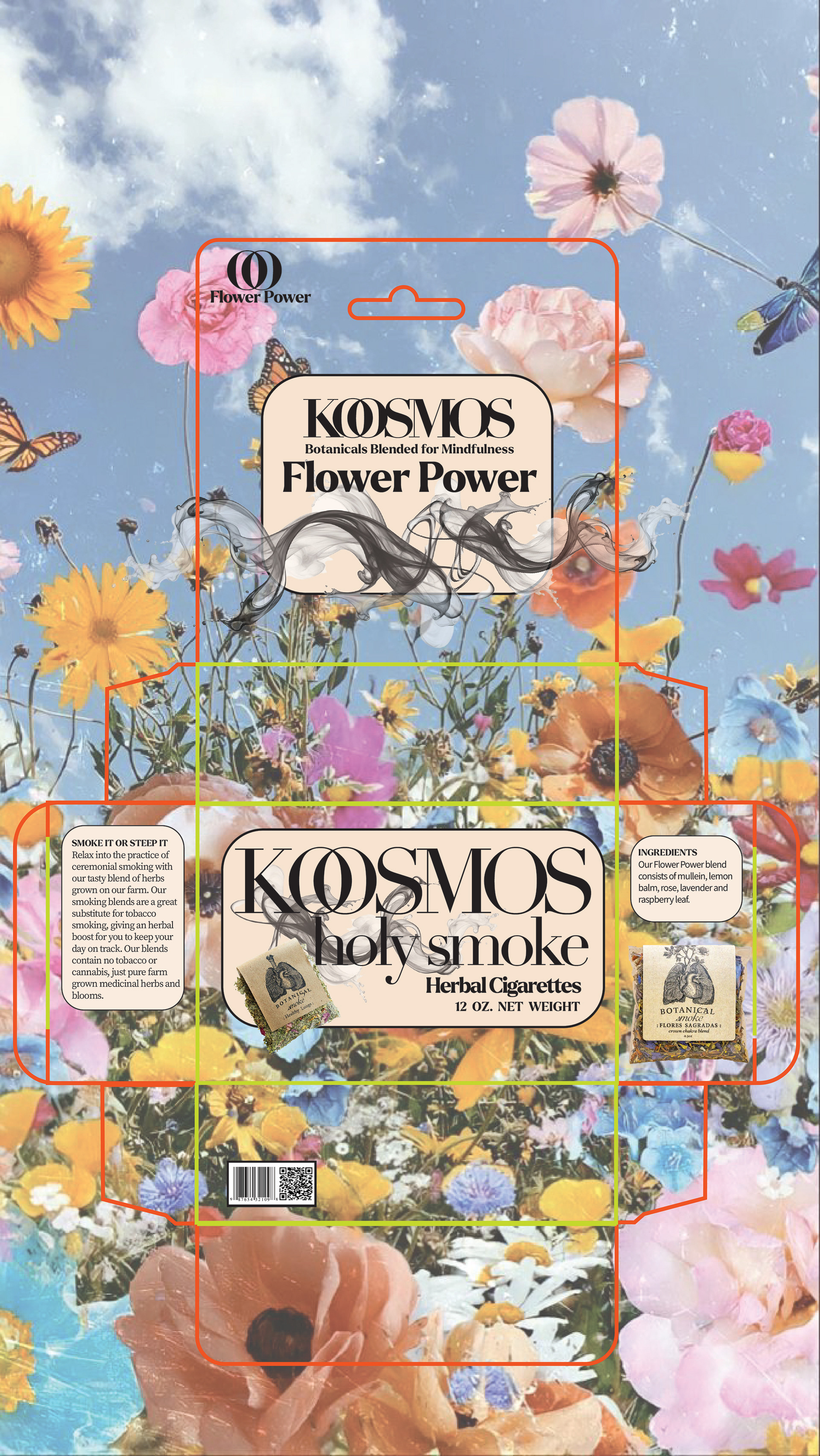
Here, I’ve included the original flat version of the design along with its dielines. Dielines function as the architectural blueprint for packaging—they indicate precisely where the piece will be cut, folded, glued, or perforated during production. Without them, a printer has no accurate guide for transforming a flat layout into a three‑dimensional object.
The flat design also reveals details that may appear more subtle in the mock‑up. For example, the black smoke beneath “Flower Power” and the product name is far more intricate when viewed in the flat version. I also incorporated the typical elements found on product packaging, such as a barcode, directions, and ingredients. These components are easier to see and appreciate in the flat layout, where nothing is obscured by perspective or lighting.