This is a rebrand project for the product 'Splash Tears'. The task was to search the pharmacy aisle and find a product that could use a new, refreshed design.
A brand brief was created as the initial step in this project. After researching the company and product, I was able to define the culture, value, customer, voice and benefit of the product. These aspects helped shape the direction I wanted to go with for the design, making it as strategically impactful as I could for the target audience.
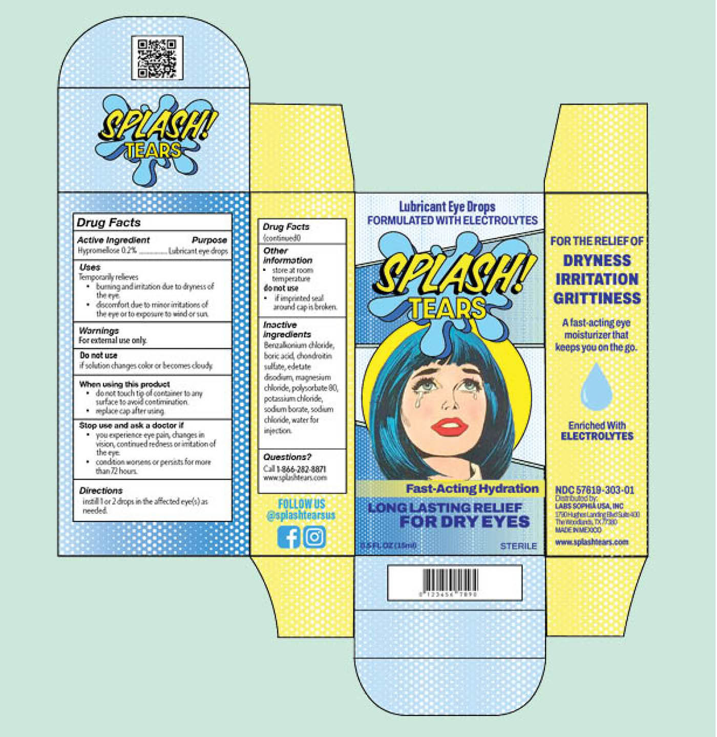
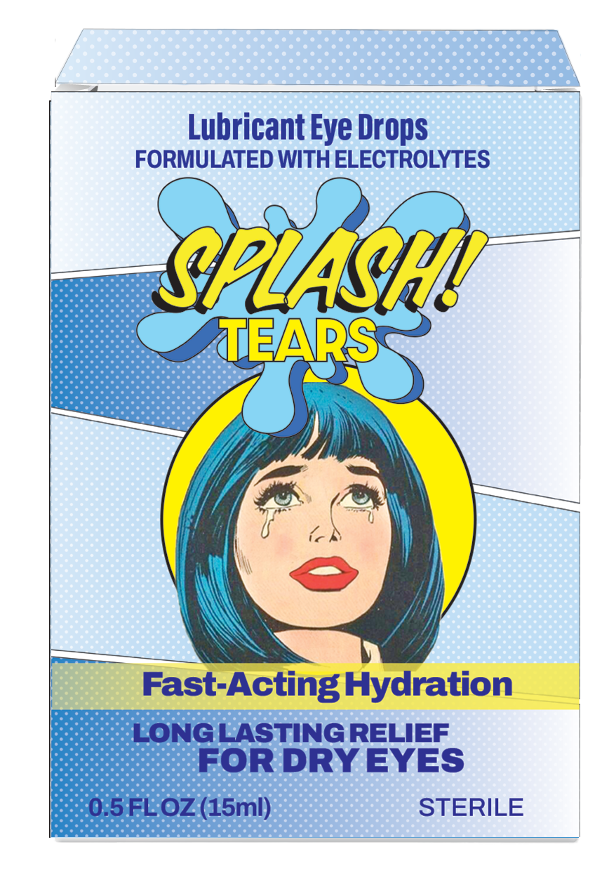
Final design packaging template created in Adobe Illustrator.
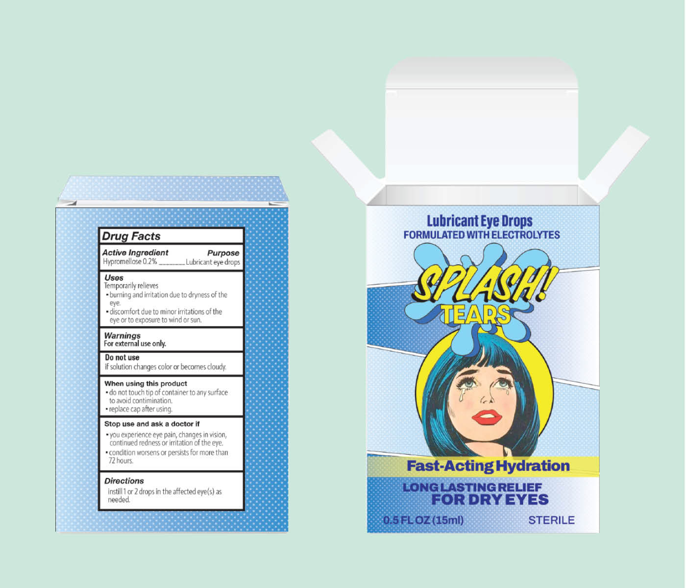
Final design mock-up using Adobe Photoshop.
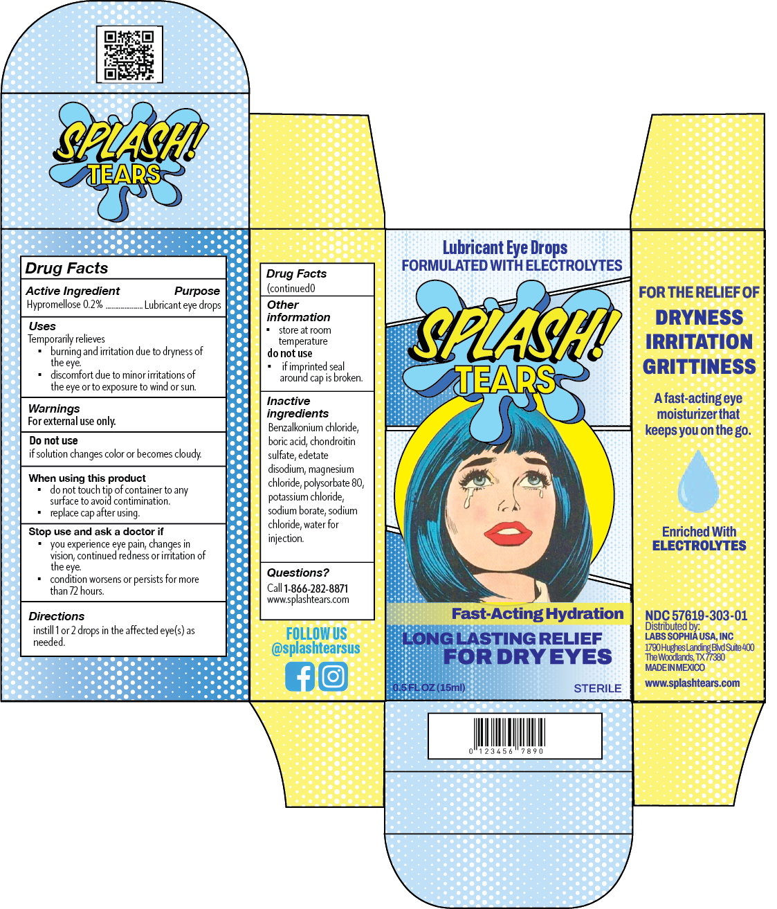
After creating a brand brief that guided me in my design choices, I created a packaging template using Adobe Illustrator, where I could place my design for the rebrand and add significant elements of the product (label, ingredients, directions, warnings, etc.) to the back and sides of the package.
The design was inspired by pop art comic books and the classic Roy Lichtenstein style with the dot pattern for background. 'Splash' was a name that could really work with the pop-art idea and I created a new logo using the font Calgary Script OT for 'Splash' and offset it with Dazzle Unicase for 'Tears'. To really make the Splash pop so I added an illustration of a big splash of water behind the text, in classic comic book style.

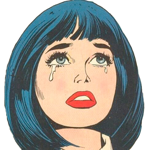
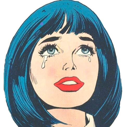
I wanted to use a classic pop art comic book image of tears. However, I didn't want to convey sadness with the tears so I used Adobe Photoshop to change the shape of the mouth using the Liquefy option. The image on the right gives the feeling of relief, whereas the image on the left gives sadness.
Here's a side-by-side view of the original packaging alongside the rebranded packaging.
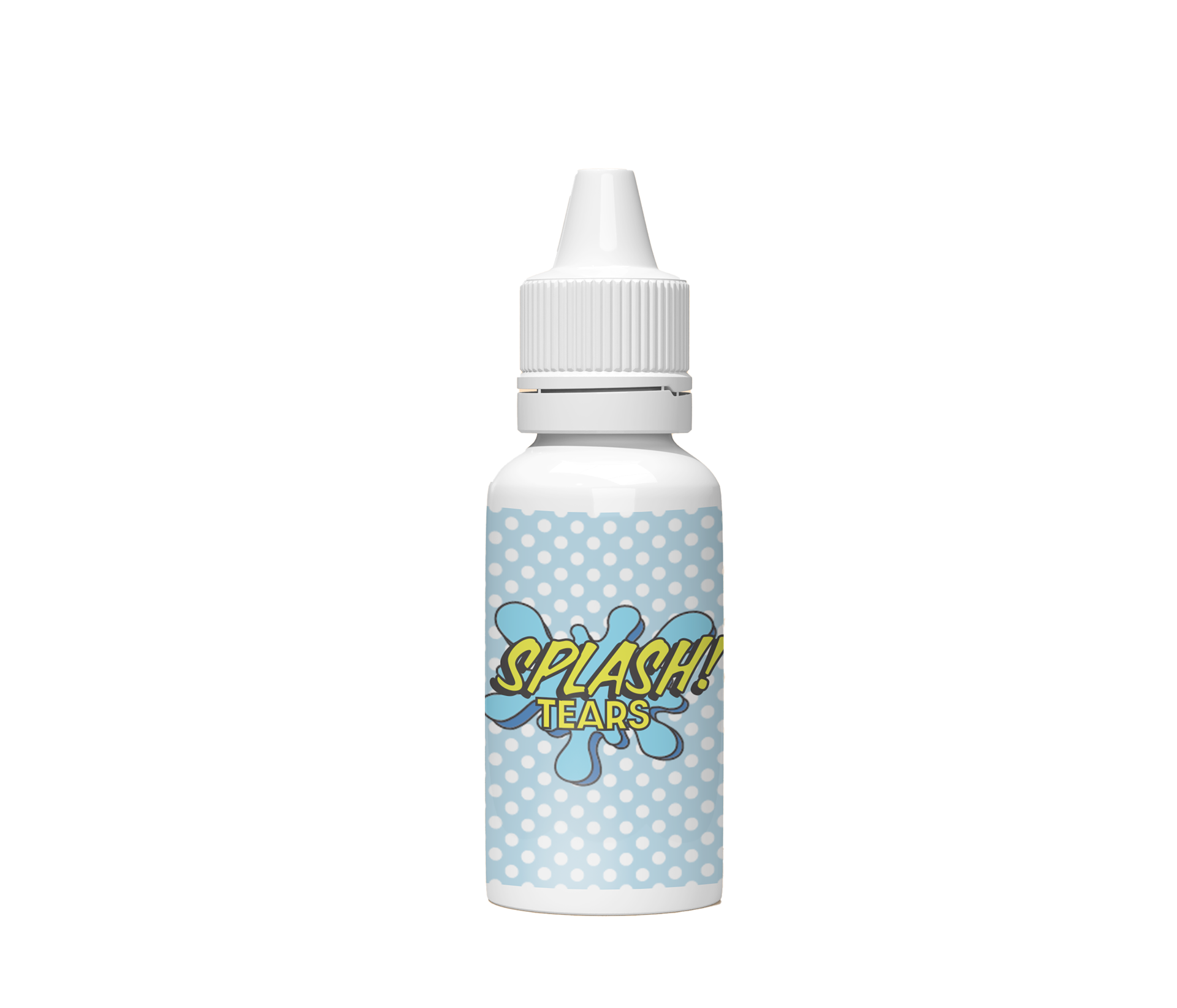
Dropper bottle mock-up and design.